UI designer — Responsive Design, Visual Design, User Flows, Design System
big-picture.com
The Sparkasse bank is one of the 5 free public banks in Germany and the largest saving bank in the country.
Hamburger Sparkasse (Haspa) leads as the premier financial institution for private customers and medium-sized businesses in Hamburg. In addition to its banking services, Haspa stands out for its strong social commitment to the metropolitan region.
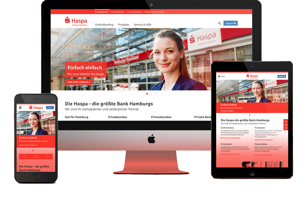
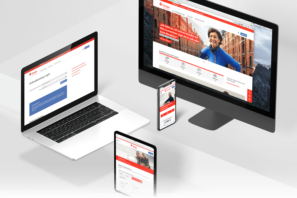
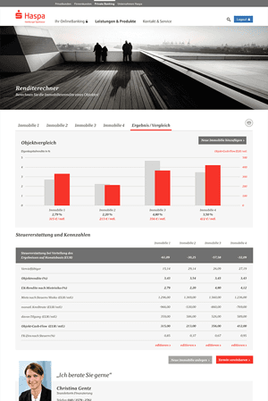
Our design objective was to refresh Haspa’s digital presence by adhering to fundamental design principles while introducing modern enhancements. The project involved developing a responsive website that delivers a more intuitive user journey and an engaging Look & Feel. By focusing on simplicity and optimization, we crafted an experience that aligns with Haspa’s values and the needs of its diverse audience.
Since its foundation in 1827, Haspa has been the bank for all citizens of Hamburg. Their first website launched in 1998 and remained unchanged up to this date.
The client was keen to ensure a smooth transition, focusing on designing user flows that addressed any potential friction for their loyal customers.
The Sparkasse website had not been updated, while the Berlin branch was undergoing a redesign. Haspa, however, wanted a unique Look & Feel that reflected their identity.
The challenge was to create a distinctive image that represented the larger brand while standing out. Our only guidelines were the "Haspa red" brand color, the logo, and the typography.
The new responsive website had the goal to provide all information and features in any and all devices
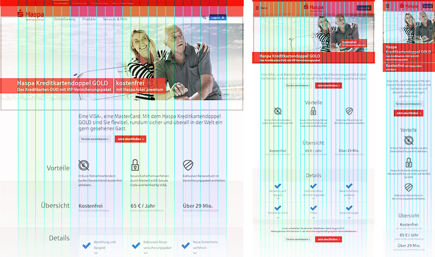
A standard set of layouts grids and breakpoints was critical.
Images, pictures, graphic and videos scale proportionally and always take up the same percentage width on the page. The aspect ratio remains the same. Images are not cropped.
Headlines, sublines, texts, text links and icons scale smoothly. While buttons, text-fields and other elements remain consistent.
Distances between components always take up the same percentage value on the page.
VISUAL DESIGN DIRECTION
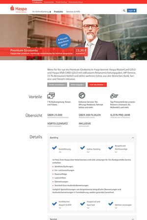
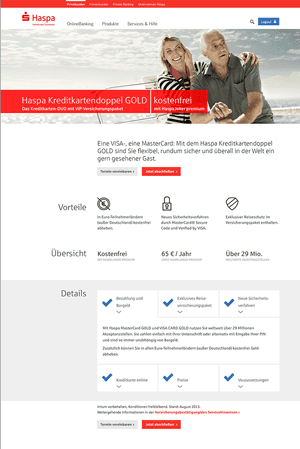
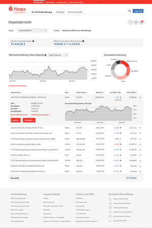
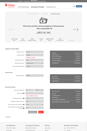
The goal was to bring Haspa into the modern era, making the website not only responsive but also energetic and dynamic. Bold typography, rounded iconography, and engaging images set the tone.
By categorizing users into two main groups, we created distinct Look & Feels that reflect each group’s unique relationship with the brand.
HIGHLIGHTS
The imagery was key on the redesign of the bank, by clearly differentiating the way of approach the users through out color, saturations and the models used in the Hamburg shootings.
HIGHLIGHTS

Before

After
HANDOVER
In order to ensure consistency in the future, the team built an internal website with the complete Style Guide & Design system for Haspa.
Any employee, with the correct credentials, has now access to all the elements, components, typographies, colors, images and icons, and to their design specs and behaviours, as well as being able to download them.
HIGHLIGHTS
